

Microinteractions: small details for a professional look

The feeling of a “professional website” is often found in details that almost no one consciously notices:
Hovers, transitions, subtle feedback.
It’s not always the entire layout that makes a site look professional.
Often, it’s how it responds to the user.
Microinteractions are these small behaviors:
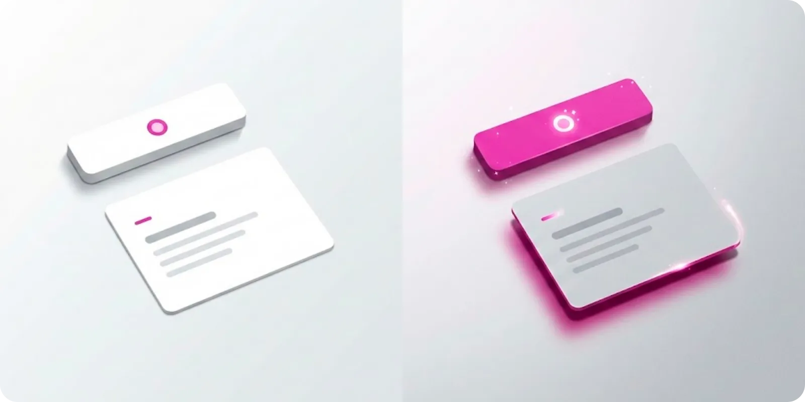
A button that changes slightly on hover, a card that gains a shadow when focused, a form that clearly shows it has been sent.
We like to treat microinteractions as product finishing.
Why do microinteractions matter?
They:
- Give the feeling that the site is “alive”
- Help the user understand what is happening
- Convey care and attention to detail
- Reinforce identity when well integrated with the brand
It’s not about filling it with animation.
It’s about choosing key points to converse with the user.
Where to apply microinteractions
Some places that almost always benefit:
- Main call-to-action buttons (CTA)
- Clickable cards
- Menus and navigation
- Forms (error, sending, success)
Details like:
- Slight color change
- 1 or 2 pixel movement
- Soft shadow appearing
- Opacity transition
Already make the interface more human.
Cautions not to overdo it
- Keep duration short (usually between 150ms and 300ms)
- Use small movements, so as not to tire
- Avoid applying animation to everything
- Ensure nothing depends solely on animation (accessibility)
The idea is for the user to feel the site responds to them, not that they are in a carnival of effects.
Microinteractions as part of the brand
You can use:
- The main identity color in focus and hover states
- A certain “rhythm” of animation that matches the positioning (softer, more energetic...)
- Specific icons for feedback (ok, error, loading...)
These are details that, added together, give the feeling of “this was thought out with care”.
More ideas
to explore
Discover articles with clear insights on content, web, and user experience to inspire your brand.