

Clean layout is not empty layout

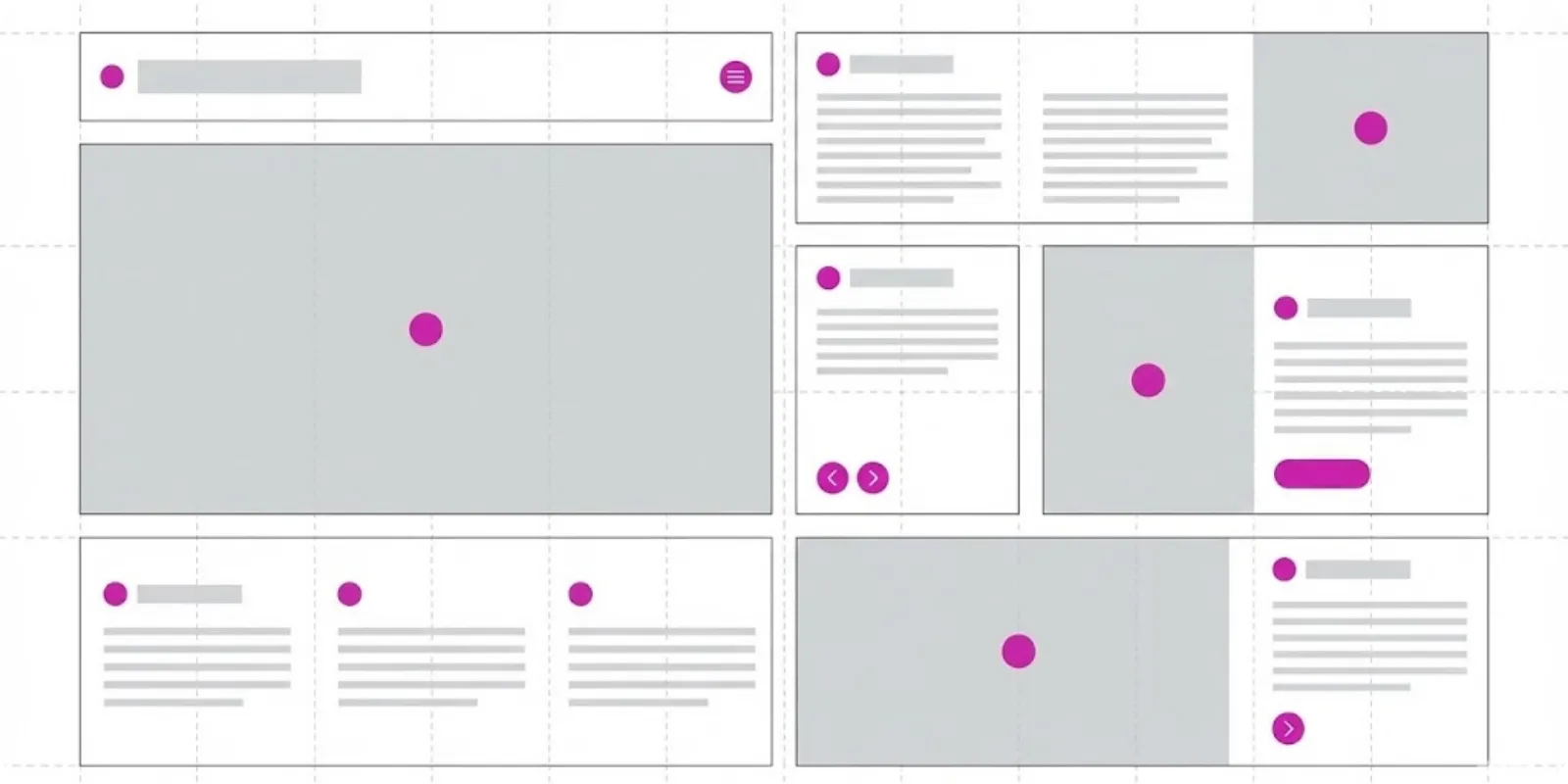
“I want a very clean layout.”
If you work in digital, you've heard this phrase many times.
The challenge is that, in practice, many people interpret “clean” as almost nothing on the screen.
Result: pages that look like drafts, little information, and zero personality.
White space as a tool
White space serves to:
- Separate blocks of information
- Give breathing room between texts
- Create focus on important elements
When used on purpose, it organizes.
When used in excess or without criteria, it conveys the feeling that “there’s nothing here”.
Signs that the layout is too clean
Some symptoms:
- You read the whole page and still haven't understood what the company does
- There isn't an element that seems more important than the rest
- The user has to guess where to click because nothing stands out
At this point, the problem is not the lack of graphic elements.
It is the lack of hierarchy.
Visual hierarchy without clutter
You don't need to fill the screen with things to create hierarchy.
Some simple adjustments help:
- Use different sizes for titles (H1, H2, H3)
- Apply contrast between main text and supporting text
- Vary font weight (regular, medium, bold) where it makes sense
- Highlight important buttons with brand color
The goal is that, even glancing quickly, the person understands the order of what to read.
How to keep it clean with personality
Clean does not mean neutral.
You can:
- Work with typography that has more character (without losing readability)
- Use the main business color in strategic details
- Bring photos or illustrations that speak to the visual identity
- Apply smooth microinteractions (hover, slight movement) to give a finished product feel
All of this fits into a “clean” layout.
As long as every choice has a reason.
A quick test
Open the page and zoom out until it gets very small.
Can you still:
- Identify the main title?
- Recognize where the CTA is?
- Perceive different blocks of information?
If yes, the layout is clean and organized.
If the page turns into a uniform mass, maybe it's clean... too clean.
More ideas
to explore
Discover articles with clear insights on content, web, and user experience to inspire your brand.